CCPA Opt-Out by TermsFeed
 
ADEX Awards Call For Entries 2024-25

Phoenix Commercial Office

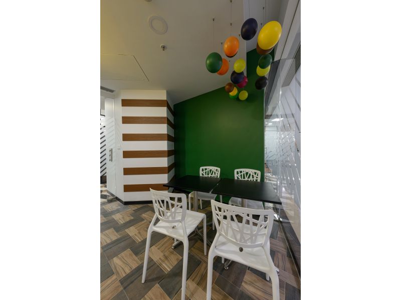
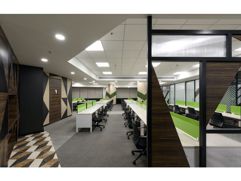
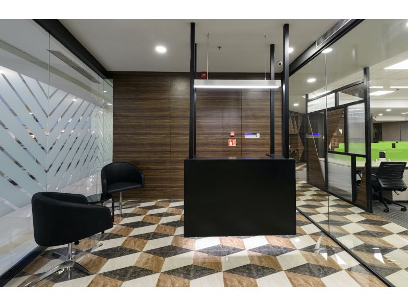
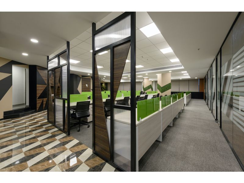
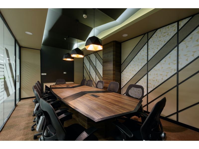
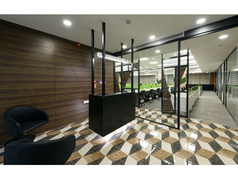
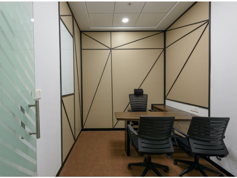
ConceptIt’s not everyday that one comes across an office space which is triangular in shape. Given the infrequent nature of this occurrence, it was quite a surprise when I was given the opportunity to work on one such place. It was a novel experience which provided a set of delightful challenges to tackle. From the moment I first saw the plan of this office, it was clear to me that the design concept was going to revolve around a triangle. This was achieved by using various materials with triangular patterns, creating our own unique 3D patterns by means of paints and pattiwork and a mélange of textures and colors. Open Plan Office The triangular central space houses the open office, whose bright and pleasant green-tinted glass creates a cheerful ambiance. One side of the space abuts the façade bringing in ample day light which makes the space look bigger. The modular workstations are made of plywood which ensures durability while at the same time giving them an impeccable finish.The second side of the space is largely housing services and hence consists of a lot of blank walls, making it a perfect canvas for a adding well-composed triangular pattern. The pattern is not only a visual delight but it also takes away the feeling of the space not being conventional square or rectangular box. The third side of the space is a glass partition which allows visual extension of the space into cabins. The glass partition is embellished with a very nonconventional pattern of diagonally arranged stripes. Adhering to the practice of infusing new materials and textures into our designs, here we have added elements made with polycarbonate sheets, which creates a beautiful serrated texture. We believe that the play of texture always adds to the timelessness of any space. The ‘jalli’ element at the entrance of open office and the table designs inside cabins is created by using triangular modules made of polycarbonate sheets. Wassily Kandinsky, a renowned Russian painter, once said that “Colour is the power which directly influences the soul.” Keeping in mind these pearls of wisdom, the office space has splashes of vibrant green colour in different textures. Cabins For the cabins, our approach was of “Less is More”. The space largely beige-coloured, studded with well-proportioned triangular patterns, made of wood pattis. Board RoomThe board room is a formal space, with beautifully composed lines running through the whole space; making it not only interesting in elevation but also creating an inter-connected three-dimensional experience. This is further enhanced by the triangular section of central ceiling. The pendent lights are also selected on similar lines. Overall, the board roomexudes hospitable vibes.Meeting Room Accessible from the reception area, the Meeting Room exudes fun and relaxed vibes. The green-grass and patti pattern on the wall is visible from the outside corridor and is a proverbial feast for the eyes. The table top is creatively filled with multi-coloured balls, adding a certain charm to the area.Reception Area Keeping in mind the briefness of its functionality, the reception is a small area. To maximize the feeling of space, patterns are infused into the floor. These patterns naturally flow into the open office, rendering the glass partition between the reception and office invisible. A stunning suspended black colored box is the reception table, which allows uninterrupted flow of flooring pattern. Sometimes, 'Simple is Elegant' and as such the backdrop to the reception is kept simple with a very neutral wood grain laminate. Café The Café is a small functional space with a small installation made of multi-coloured balls, white chairs and neutral black tables. The yellows of storage along with green hues on the wall, give a feeling of freshness and fun.Breakout Area The Breakout area is an elevated space, carved from the balance triangular nook. The walls have green-coloured grass elements, complimenting the overall splash of green in the open office space.

Studio Rakhi M is a Boutique Interior and Architectural design firm focused on delivering best in class services to its clients . We strive to design spaces that truly showcase the user's aspirations, values and beliefs without compromising on utility and expectations from the space.While each project that we undertake would be shaped by its own set of influences and client requirements, a common thread that runs across projects and the way we shape them is our interest and ability to delve deeper into how people engage with buildings and spaces. We try to seek out the ingredients that make the difference between a successful place that has spirit and life and one that suffers from being soulless and alien to the people that use it.The Studio maintains the freshness of the designs through hands-on involvement of the founder who brings to the table vast reserves of knowledge and experience developed over more than a decade. We are not volume focused and see immense merit and value in handpicking engagements and delivering the best possible quality and the minutest attention to detail. Our clients, consultants and vendors are our most esteemed partners; many of whom have worked with us more than once - we believe they are truly responsible in helping us deliver the best each time.With a process driven Approach, studio is totally cutting edge about delivery.
ADEX Awards Call For Entries 2024-25
archinterious.com, adexawards.com & designjournalmag.com is part of Archinterious/ADEX Awards™. All content, graphics are copyright © with publisher. Any commercial use or distribution without the express written consent of publisher is strictly prohibited.
Copyright © 2024 Design Journal / Archinterious /ADEX Awards™,
2456 Sturrock Dr, Henderson, NV, 89044, United States.
All Rights Reserved.